There’s a reason why walking around recreational areas like malls and supermarkets makes you want to buy more products. There’s a mental aspect to mall-hopping that just leaves a positive impact on the buyer and makes them want to buy more. This phenomenon is a lasting impact left by a concept known as Retail Design.
In this article, we explore more about it.

Why Captivating Retail Design is Important
Retail design is a skill that every store owner should have. You’d be surprised at how much a pleasing aesthetic and an easy-to-navigate physical layout can significantly increase brand recognition and sales.
So, be sure to maximize every inch of space you have. Happy customers who enjoy their shopping experience with you are more likely to buy from, recommend, and return to your shop. These customers are also more likely to take pictures of your store to post on their social media accounts. That means free advertising for you!
The benefit of a captivating retail store design is obvious: return customers and profit, especially if it’s your flagship store. The upfront capital required to implement retail design concepts in your store should theoretically return dividends and generate revenue that far outweighs the initial investment. Countless studies have shown the positive impact that captivating retail design has created, for both the retailer and consumer.
Keep reading for some tips and tricks on how to improve your store through retail design!
Principles of Captivating Retail Design
Understanding why retail design is relevant is different from the process of the actual implementation. We’ll now provide an outline of the principles of creating a captivating retail design.
Think of the Big Picture
The overall goal of retail design is the creation of a pleasant shopping experience for the consumer. Instead of a quick, forgettable trip in and out of your store, you want shoppers to enjoy their time spent with you. So, before you even begin applying the different retail design tips and tricks outlined in this article, it is important to think of the big picture.
Often, this goes back to ground the design of your space to your unique brand. Ask yourself these questions: How do I want to be seen? What impressions do I want to make? Are there strengths I want to highlight? What message do I want to send? Is there a story I want to tell? What feelings do I want to evoke? Keep these ideas in mind when setting up your place.
To make sure consumers are able to appreciate your big picture, put yourself in their shoes. Literally. The first thing a customer does when they walk into a store is a quick scan of the shop. Make sure they are able to see the whole store by moving larger, potentially obstructive fixtures to the back. If you want to highlight certain products, make sure they are not hidden from the point of view of the doorway of your shop.
Draw Their Eyes In
Retail design isn’t just about the inside of a store. The exterior design of a shop is just as important, or maybe even more important than its interior design, as figuring out how to get people to enter an establishment is the first challenge of a store owner. So, don’t miss out on the chance to draw consumers’ eyes in by improving the exterior design of your shop.
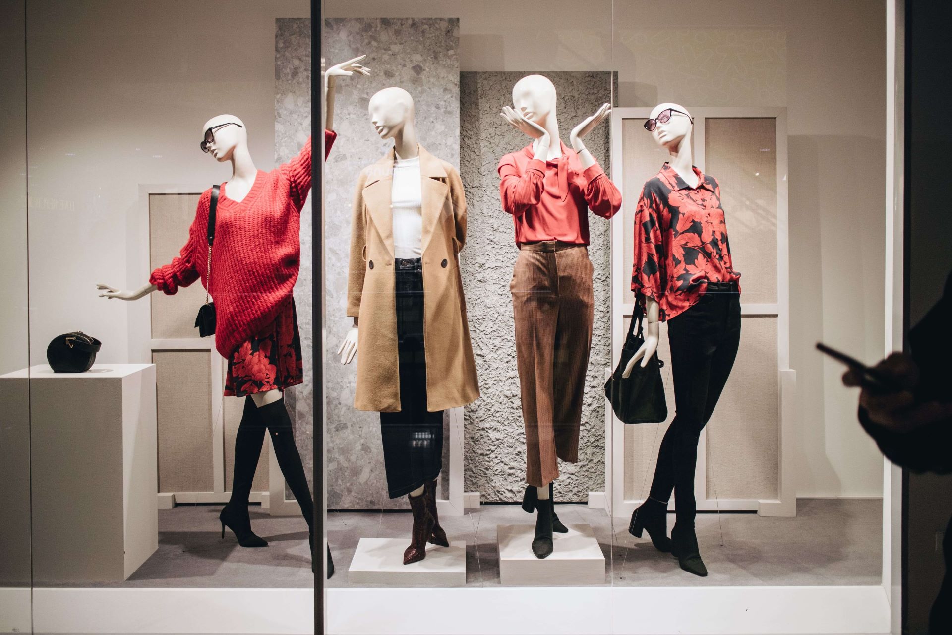
Make sure all signage is clean, legible, and recognizable. Utilize window space by putting your best products on display by the windows of your shop. You can also advertise sales and other promotions on your windows.
However, use signs wisely. Customers may not retain the pertinent information you want to highlight on a sign if there is too much written on it. Customers may not even read your sign in the first place, as having cramped signs or having too many signs can be overwhelming.
Give Them Space to Adjust
When a consumer walks into a store, the first area they encounter is the “decompression zone.” While this depends on the size of the store, the decompression zone is usually 1.5 to 4.5 meters. Customers need to shift from whatever they are doing outside of the store to shopping, and the decompression zone is where they do that.
You need to give customers space to adjust. Shoppers tend to ignore everything in the decompression zone. So putting products, signage, or even shopping carts or baskets in this area is futile. Instead, place these items just outside the 1.5 to 4.5-meter perimeter of the decompression zone.
Highlighting the differences between the inside and the outside environment can help shoppers adjust more quickly to your shop, thereby making the decompression zone smaller. For example, have flooring and lighting that contrasts with the outside environment.

Control the Flow of Traffic
Controlling the flow of in-store traffic is essential to a good shopping experience. This can prevent congestion, which can lead to an array of mishaps like people bumping into each other. It can also ensure that customers can fully access all the products and parts of a shop.
Even staff benefit from the control of in-store traffic. It allows them to easily monitor and assist customers, especially when they need to move back and forth when assisting multiple customers or when retrieving products from storage areas.
The control of in-store traffic is dependent on a store’s layout, which refers to the arrangement of permanent fixtures within a store. Permanent fixtures can range from mannequins, racks, hangers, wall displays, display cases, and more.
When setting up permanent fixtures, there are different types of store layouts that you can choose from depending on your retail merchandising goals. There is the Grid layout, where products are displayed in long aisles and customers weave up and down the aisles. A classic example of establishments that use this type of layout is grocery stores. There is also the Straight or Spine layout, which is often seen in department stores. In this layout, the main aisle, called the spine, connects various sections of the store. Another layout is the Angular store layout, which ironically is the use of rounded product displays, curved walls, and other curved fixtures.
If none of these layouts are to your liking, there are many more store layouts that you can research, such as the Herringbone, Loop or Racetrack, Boutique, Diagonal, and Geometric store layouts. You are also free to mix and modify store layouts to fit your specific needs.
The last tip regarding the control of in-store traffic is to monitor customers’ foot traffic. How do shoppers flow through your store? You can answer this question manually, by using counters, or digitally, by using cameras and retail tracking software. You can then adjust your store layout depending on the results of your analysis. For example, by monitoring foot traffic, you will be able to determine the most visited areas of your store and adjust permanent fixtures to create shortcuts to and from these most visited areas.
Remember, Less is More
In an attempt to grab a shopper’s attention, you might be tempted to put all your merchandise on display and surround it with the loudest decorations possible. However, you have to be strategic with the number of items in your store and the presentation of these items. Too much merchandise and decor can be an obstruction for shoppers. It keeps them from being able to see your whole store (remember, let them see the big picture!), and it makes it harder for them to move through your space (remember, control the flow of traffic!). In this instance, less is more!
To minimize the number of items you need to fill up your store, use products as decor. Moreover, when designing displays, make sure to have one product act as the focal point of the whole display. Position this product at eye level, and surround it with other items that bring attention to it. For example, items that are of a different type (bags vs. shoes), items that are smaller, or items of a contrasting color. This is a much more efficient way to get customers hooked.
Set the Mood with Good Lighting
Lighting is a powerful tool in retail design. There are different types of lighting. Ambient lighting refers to the main overhead lighting of the store. If it is too dark, it will be hard for customers to see products and read their labels. If it is too bright, it can strain customers’ eyes and cause headaches. It is important to find the perfect balance of darkness and brightness, and this will largely be based on the size of your shop.
Another type of lighting is accent lighting, which is lighting used to highlight certain areas, products, and signages. It is a great way to bring your customer’s attention toward what you want them to see. An example of commonly used accent lighting is spotlights that are placed on the merchandise displayed by the windows of a store.
On the other hand, decorative lighting is also very important. While it may not be necessary to illuminate your space, decorative lighting can greatly influence the mood or atmosphere of a store.
Be Picture-Perfect
In this digital day and age, your store itself should be photogenic. Your displays should look good in real life, but also in pictures. So, always check what your store looks like through the lens of a phone camera. Aside from that, go a step further and deliberately set up a space that is meant for taking photos.
Be picture-perfect, and you’ll benefit from the free advertising from a customer posting and tagging you on their social media account. Some customers might even visit you just for the photo opportunity, but leave with a purchase! This might mean sacrificing some of the space in your store where a display could’ve gone, but the return is worth it.
If you are a clothing, accessory, or cosmetic shop, the easiest way to be picture-perfect is by investing in good mirrors. Mirror selfies are some of the most common pictures posted on social media, so having designed mirrors or mirrors accompanied by backlighting can greatly increase the photos taken in your store. This is a retail design trick that isn’t too costly as your shop is likely going to need mirrors anyway.

How the Evia Lifestyle Center Creates A Captivating Retail Design
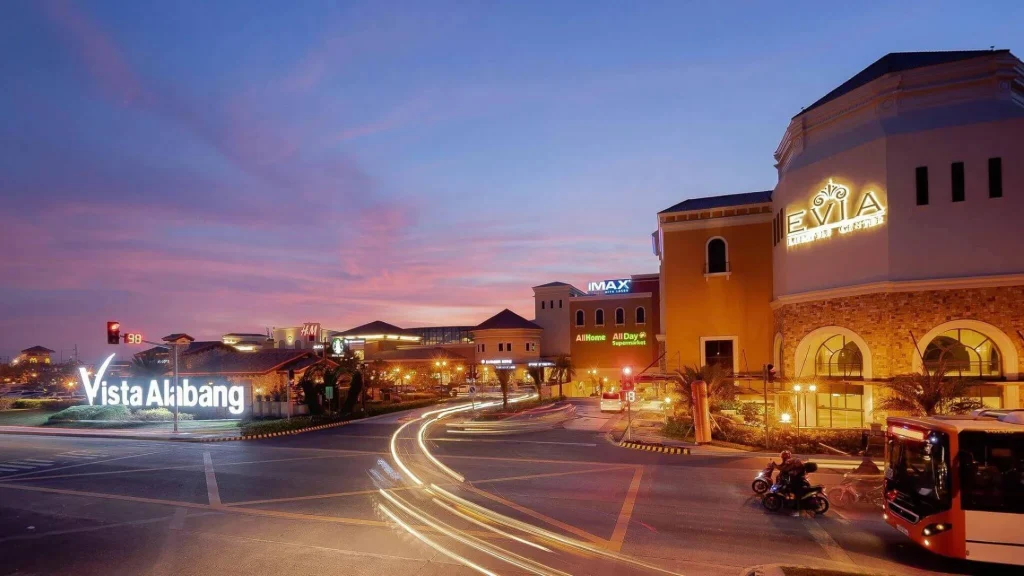
A good example of an establishment with excellent retail design is the Crown Jewel of the South, Evia Lifestyle Center. It is located on Daang Hari Road in Las Piñas, Metro Manila, and is open from 10 AM – 9 PM on Mondays to Thursdays, and 10 AM – 10 PM on Fridays to Sundays.
The Evia Lifestyle Center has everything. You can find shops for your day-to-day needs and world-class restaurants and cafes. You can also catch a movie in their VIP Theatre or IMAX with Laser Cinema. The IMAX with Laser Cinema is the first of its kind in Southeast Asia and offers viewers an MX4D Motion experience.
What truly sets the Evia Lifestyle Center apart from other malls is its retail design, which can be seen in its sophisticated architecture that makes you feel as if you are shopping abroad! Customers can walk around the spacious hallways of the mall while appreciating the beautiful indoor plants and garden landscapes and the dynamic indoor sky ceiling.
The Evia Lifestyle Center is located near the projects of the leading real estate developer in the Philippines, Crown Asia Properties. Of the different Crown Asia house and lots for sale, it is nearest to the Italian-themed gated subdivision Ponticelli, which is just along Daang Hari. Ponticelli features luxurious amenities like a swimming pool, clubhouse, gym, basketball court, function room, jogging paths, barbeque area, and playground, which is perfect for growing families!
Also in Las Piñas is The Hermosa. The Hermosa is a high-end, modern, and conveniently located condominium village comprising six mid-rise buildings. It is ideal for those who want to live a vibrant city life!
Read more: Outlet Store Shopping in Laguna


