
The colors you choose for your home can greatly influence your mood, the perception of space, and the overall ambiance of your living environment. When it comes to choosing the perfect color palette for your home, understanding color psychology is essential.
This article will delve into the fundamentals of color theory, the impact of different colors, and how to effectively utilize paint colors to create a harmonious and inviting space.
The Basics of Color Psychology
Color psychology explores how colors affect human behavior and emotions. It is a powerful tool used by interior designers to create spaces that evoke specific feelings and responses.
The color wheel, a fundamental tool in color theory, helps us understand the relationships between colors and how they can be combined to produce various effects.
Warm and Cool Colors

Colors are generally divided into two categories: warm and cool colors.
Warm colors include reds, oranges, and yellows, which are often associated with energy, warmth, and comfort. Cool colors, on the other hand, consist of blues, greens, and purples, and are known for their calming and relaxing effects.
When choosing the perfect color palette for your home, it’s crucial to consider the emotional impact you want each room to have.
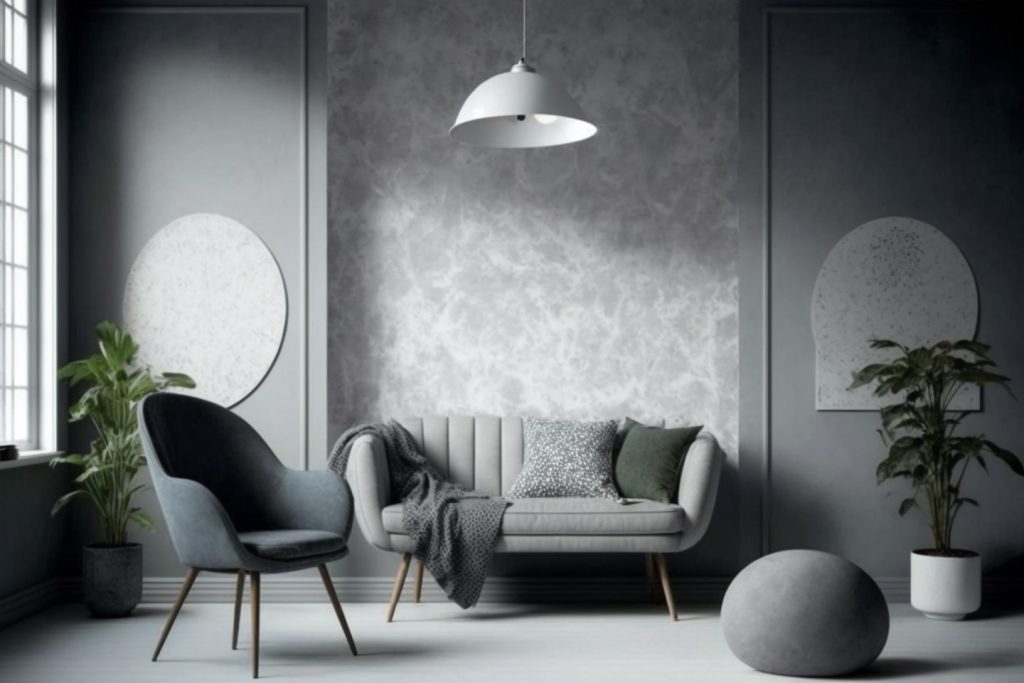
Light and Space Perception
Beyond emotional influence, color also plays a significant role in how we perceive space. Light colors, like white, light gray, and pale pastels, visually expand a room, making it feel larger and airier.
This is particularly beneficial for smaller spaces or rooms with limited natural light. Conversely, dark colors, like deep navy or chocolate brown, can create a sense of intimacy and coziness.
While they might make a spacious room feel more grounded, they can shrink the feel of a smaller area.
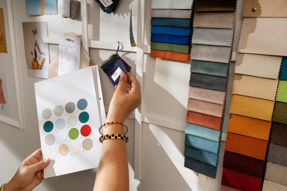
The Color Wheel and Color Schemes
The color wheel is an indispensable tool for selecting color schemes.
It helps identify complementary colors (colors opposite each other on the wheel) that create vibrant and balanced looks, analogous colors (colors next to each other on the wheel) that produce harmonious and serene effects, and triadic colors (three colors evenly spaced on the wheel) that offer a balanced and dynamic palette.
By using the color wheel, you can create a whole house color palette that feels cohesive and visually appealing.
Choosing the Perfect Color Palette for Your Home
Choosing the perfect color palette for your home is a significant step in creating a space that feels cohesive, inviting, and reflective of your personal style.
It’s more than just picking a few favorite colors; it involves understanding how colors interact with each other and with the architecture and lighting of your home.
A well-thought-out color scheme can enhance the mood of each room, create visual flow, and even impact your emotions and behaviors.
Here are a few key considerations to achieve a balanced and stylish look.
Consider Natural Light
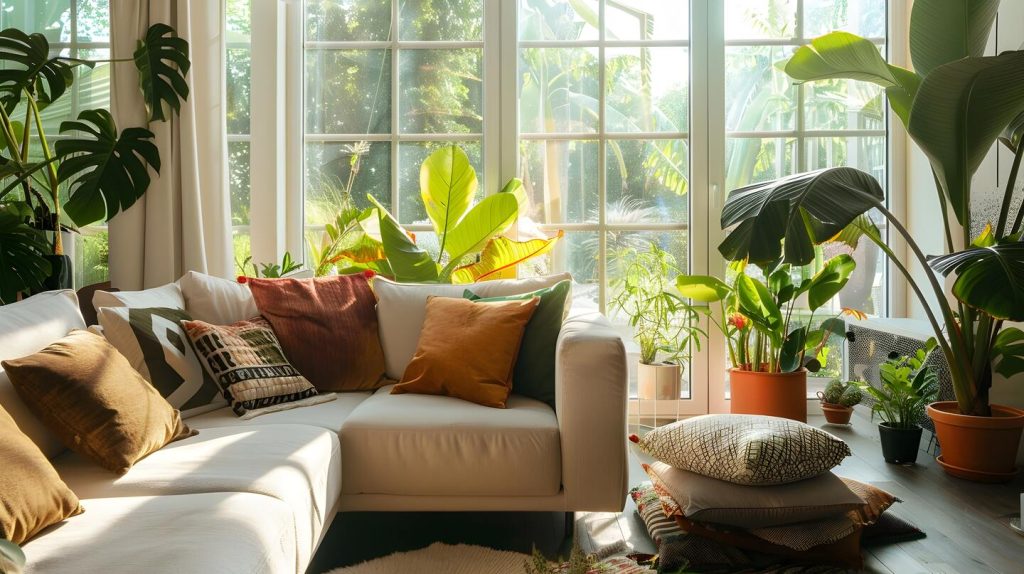
Natural light plays a significant role in how paint colors appear in a room.
Rooms that receive plenty of natural light can effectively incorporate darker or more vibrant colors, whereas rooms with less natural light may be better suited to lighter shades to avoid a dark or cramped atmosphere.
It is essential to test paint swatches in different lighting conditions to see how the colors change throughout the day.
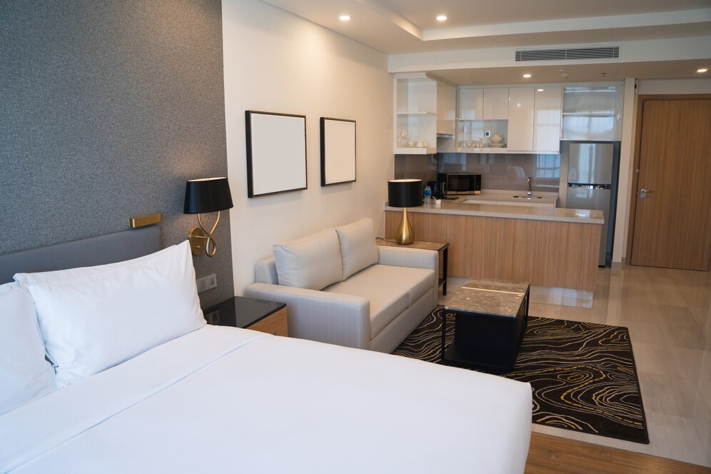
Start with a Neutral Color Palette
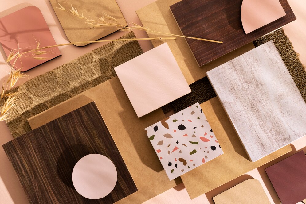
A neutral color palette serves as an excellent foundation for any home.
Colors like light gray, beige, and white provide a versatile backdrop that can be easily complemented with accent colors and decor.
Neutral wall colors also allow for greater flexibility when it comes to updating your space with new accessories or furniture.
Incorporate Accent Colors
Accent colors are fantastic way to add personality and interest to your home.
Choose one or two accent colors to complement your neutral base and use them strategically throughout your space. This could be through throw pillows, artwork, rugs, or even a statement wall.
The key is to ensure that these accent colors are consistent and cohesive with the overall color scheme.
Overall Style
The aesthetics you’re aiming for will influence your color choices.
A modern minimalist space might call for a neutral color palette with pops of color, while a traditional style might lean towards richer, warmer tones.
Room-by-Room Color Suggestions
Each room in your home serves a different purpose, and the colors you choose should reflect the desired mood and function of the space.
Thoughtful color selection can transform a room’s atmosphere, influence your emotions, and even impact how spacious or cozy it feels.
Here are some tailored suggestions for various rooms in your home to help you create the perfect ambiance.
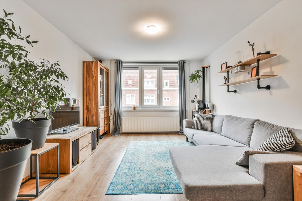
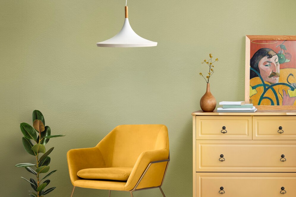
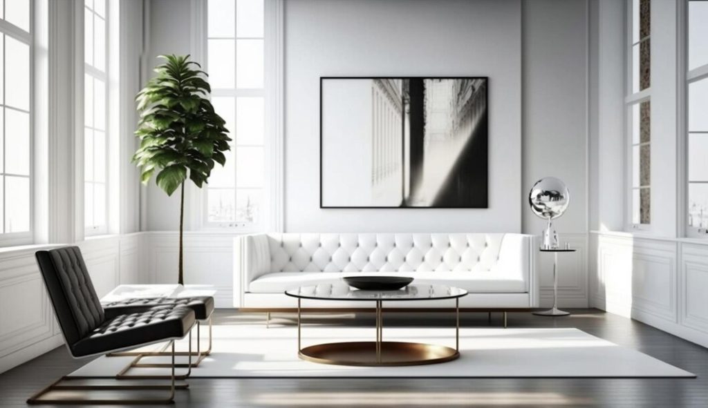
Living Room
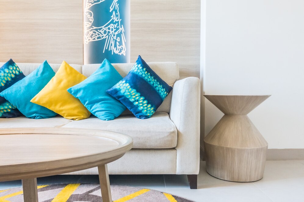
The living room is often the heart of the home, where family and friends gather to relax and socialize.
Warm tones like soft yellows, warm grays, or earthy greens can create a welcoming and cozy atmosphere. If you prefer cool tones, consider using blues or greens to promote relaxation and tranquility.
Accent colors like deep reds or rich blues can add depth and interest to the space.
Kitchen
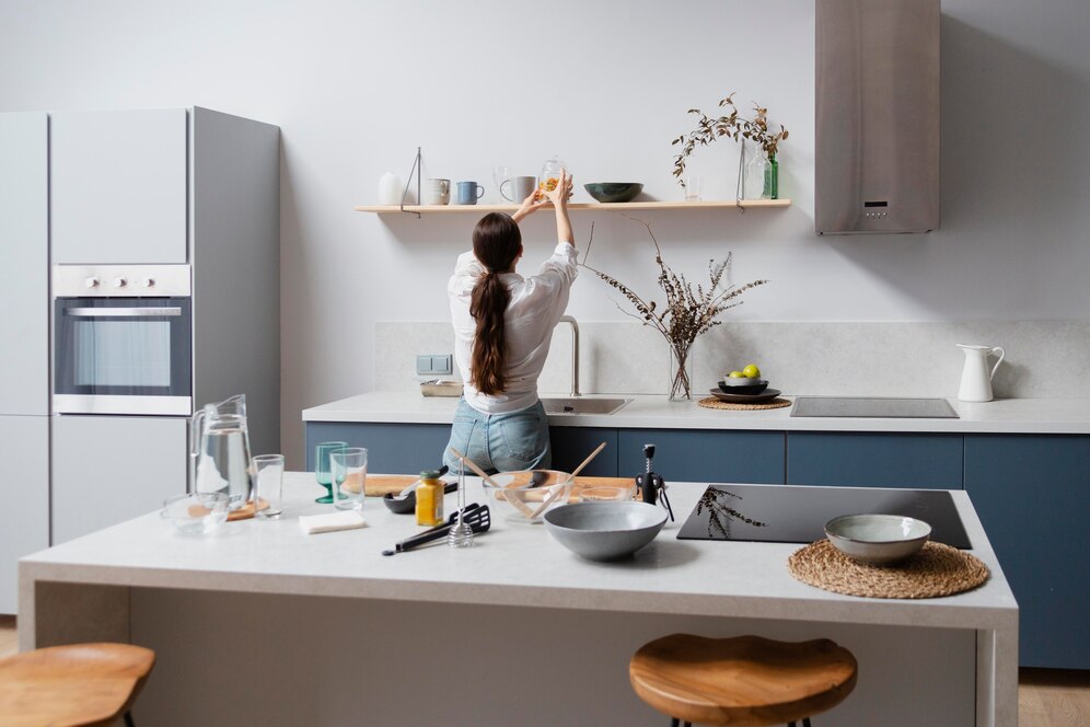
The kitchen is a bustling and energetic space, so choosing colors that stimulate and invigorate is ideal.
Warm colors like red, orange, and yellow are known to increase appetite and create a lively environment. However, if you prefer a more modern and sleek look, cool colors like light gray, white, or navy blue can provide a clean and sophisticated feel.
Remember to consider the natural light in your kitchen when selecting paint colors, as it can significantly impact their appearance.
Bedroom
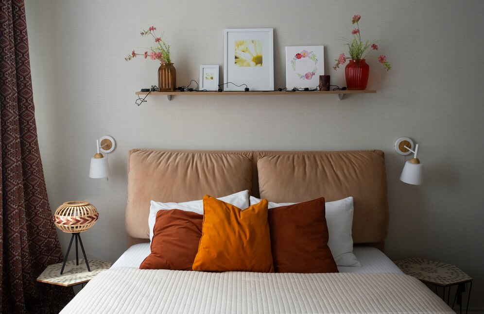
The bedroom is a sanctuary for rest and relaxation, so calming and soothing colors are best.
Cool tones like soft blues, greens, and lavenders can create a serene and peaceful environment. Neutral colors like beige, light gray, or soft whites also work well in bedrooms, as they provide a tranquil backdrop that promotes relaxation.
Avoid using overly bright or stimulating colors, as they can interfere with sleep.
Bathroom
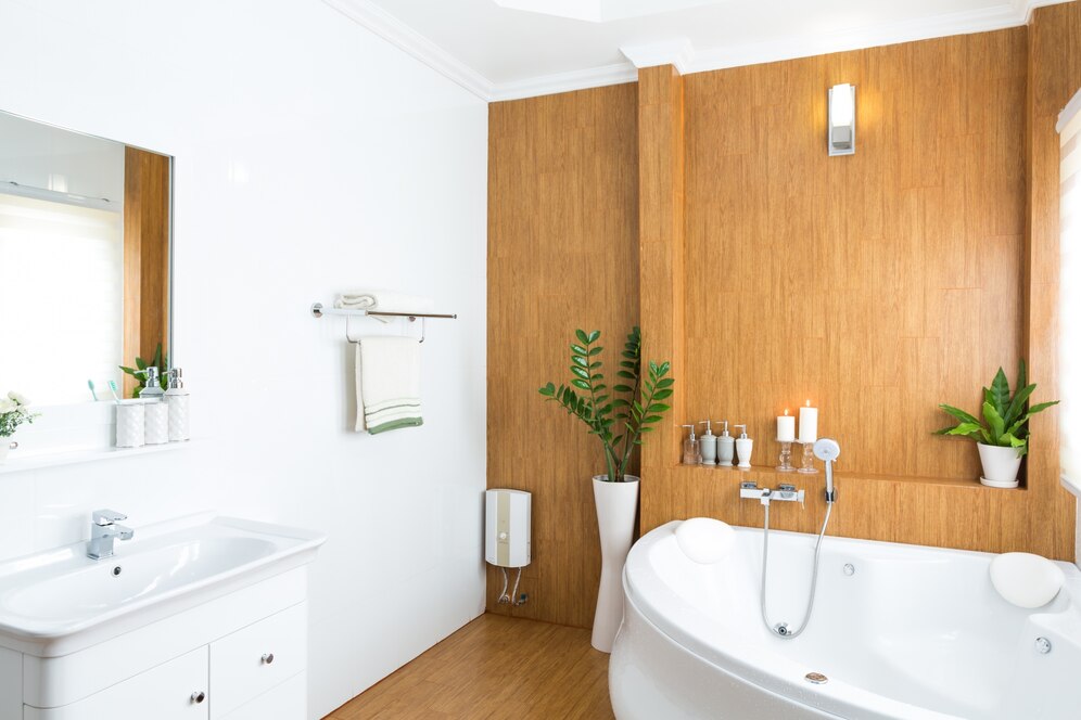
Bathrooms are often smaller spaces that benefit from light and airy colors.
Soft blues, greens, and neutrals can make the bathroom feel clean, fresh, and spa-like. Light gray is a popular choice for bathrooms, as it adds a modern touch while maintaining a soothing atmosphere.
Consider using accent colors through towels, rugs, or shower curtains to add a pop of personality without overwhelming the space.
Home Office
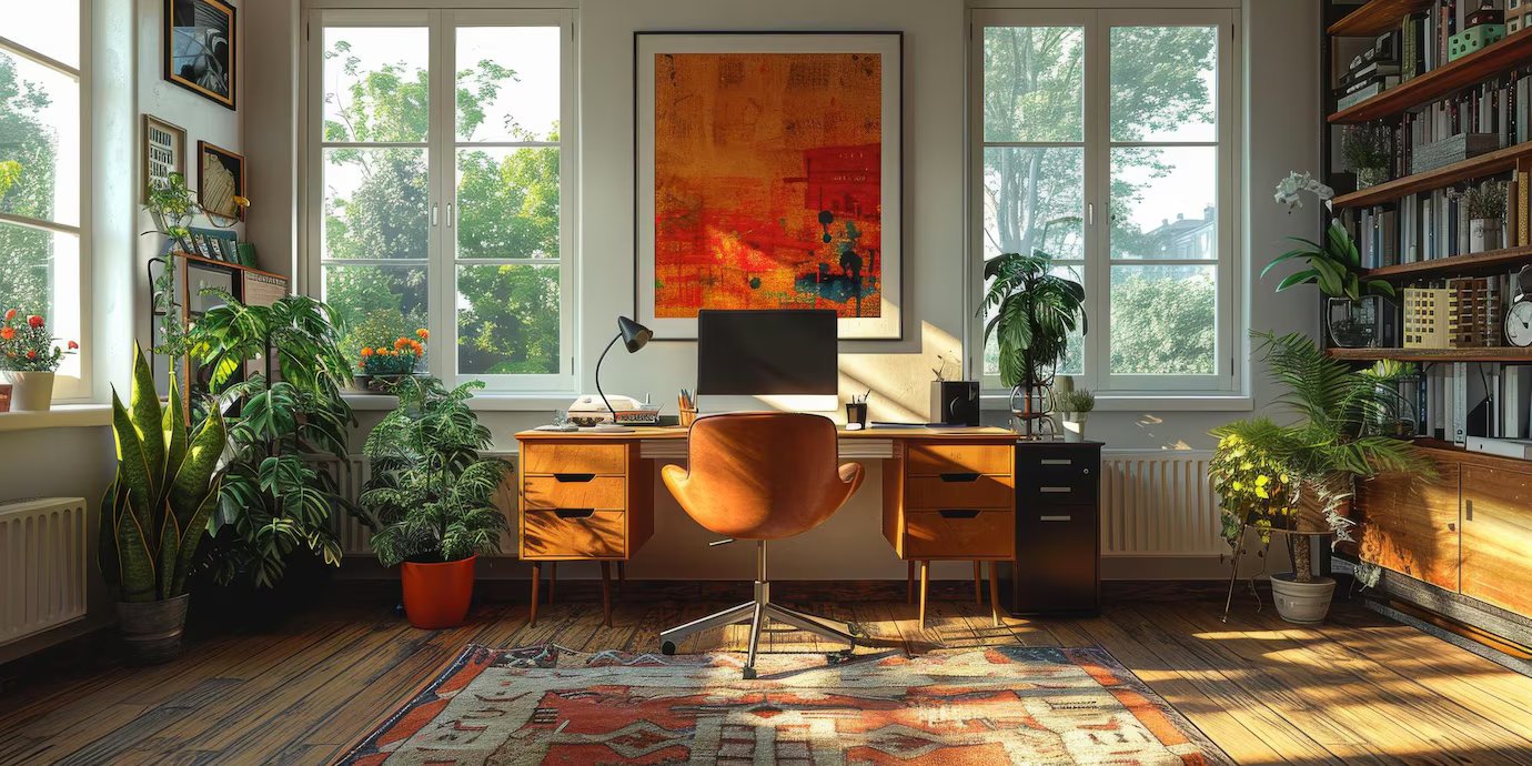
In a home office, it’s essential to choose colors that promote focus and productivity.
Cool tones like blues and greens are known to enhance concentration and calmness. If you prefer a more energetic environment, warm tones like yellows and oranges can stimulate creativity and motivation.
Light gray is also an excellent choice for a home office, as it provides a neutral and professional backdrop.
Creating a Whole House Color Palette
While each room deserves its own unique personality, a cohesive flow throughout your home creates a sense of harmony. Here are two popular approaches to consider:
Monochromatic Scheme
This approach utilizes variations of the same color throughout your home.
For example, you might choose a light gray for hallways and living areas, with a darker charcoal gray for a dramatic accent wall in the living room. This creates a clean and sophisticated look.
Neutral Color Palette with Accent Colors
This versatile approach uses neutral colors like white, beige, or light gray as the foundation, with pops of color in furniture, artwork, or accent walls.
This allows you to easily add personality and vibrancy to your space without overwhelming it.
Tips for Choosing Paint Colors
Selecting the right paint color can be overwhelming, but these tips can help simplify the process.
Test Paint Swatches
Before committing to a paint color, it’s crucial to test paint swatches on your walls.
Paint a small section of the wall and observe how the color looks in different lighting conditions throughout the day.
This will give you a better idea of how the color will appear in your space and help you make an informed decision.
Use the Same Color in Different Finishes
This technique allows you to play with light and texture without overwhelming the room with multiple colors, creating a harmonious and visually appealing environment. It’s an elegant way to add intricacy and dimension to your interior design without straying from a unified color palette.
For example, you can use a matte finish on the walls and a satin or semi-gloss finish on the trim. Matte finishes are great for walls because they provide a smooth, non-reflective surface that can hide imperfections and create a calm, understated backdrop.
On the other hand, using a satin or semi-gloss finish on the trim can make these architectural details pop. The higher gloss level reflects more light, giving the trim a subtle shine that draws the eye without being too overpowering.
Consider the Flow Between Rooms
When creating a whole house color palette, it’s essential to consider the flow between rooms.
A well-thought-out color scheme can significantly enhance the overall aesthetic and atmosphere of your home. By carefully selecting colors that complement each other, you can create a seamless transition from one space to another, making your home feel more unified and harmonious.
Start by choosing a base color that you love and can see being used throughout your home. This color can serve as the foundation for your palette, and you can build upon it by incorporating various shades and tones.
Think about how each room will connect and ensure that the colors chosen for adjacent spaces work well together. For example, if you have a living room that leads into a dining room, consider using a color in the dining room that is a shade lighter or darker than the living room.
This subtle variation can create a sense of continuity while still allowing each room to have its unique character.
Additionally, consider the mood and function of each room when selecting your colors. Bedrooms may benefit from calming, soothing hues, while more vibrant colors can energize spaces like the kitchen or home office. Don’t be afraid to use accent colors to add interest and depth to your palette.
By thoughtfully planning your color transitions and keeping the overall flow in mind, you can ensure that your home feels cohesive, well-balanced, and inviting.
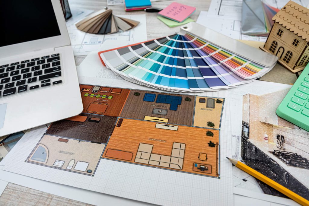
Working with Interior Designers
If you’re feeling overwhelmed by the process of choosing the perfect color palette for your home, consider working with an interior designer.
Interior designers have expertise in color theory and can help you select the right colors to achieve your desired look and feel.
They can also provide valuable insights into current trends and timeless classics, ensuring that your home remains stylish and inviting for years to come.
Creating The Ideal Color Scheme
Choosing the perfect color palette for your home is a vital aspect of interior design that can significantly impact the overall ambiance and functionality of your space.
By understanding color psychology and utilizing tools like the color wheel, you can create a harmonious and inviting environment that reflects your personality and style.
Whether you opt for warm tones, cool tones, or a neutral color palette, the key is to consider the mood you want to create and how the colors will interact with the natural light and flow of your home.
With careful planning and thoughtful selection, you can transform your living space into a beautiful and cohesive sanctuary.